Intro to Graphic Design -
Project 2: Color/Rhythm


For the 2nd project we had to pick a song, then use abstract art and color to describe the song. The chapter for this project covered the basics of color theory and psychology.
I chose the song Peace by Demon Hunter from their new album titled, Peace.
To me, the song Peace is about hardships and struggles during journeys that everyone goes through in life. They somehow find themselves in a dark place, and are trying to find or come to terms with peace.

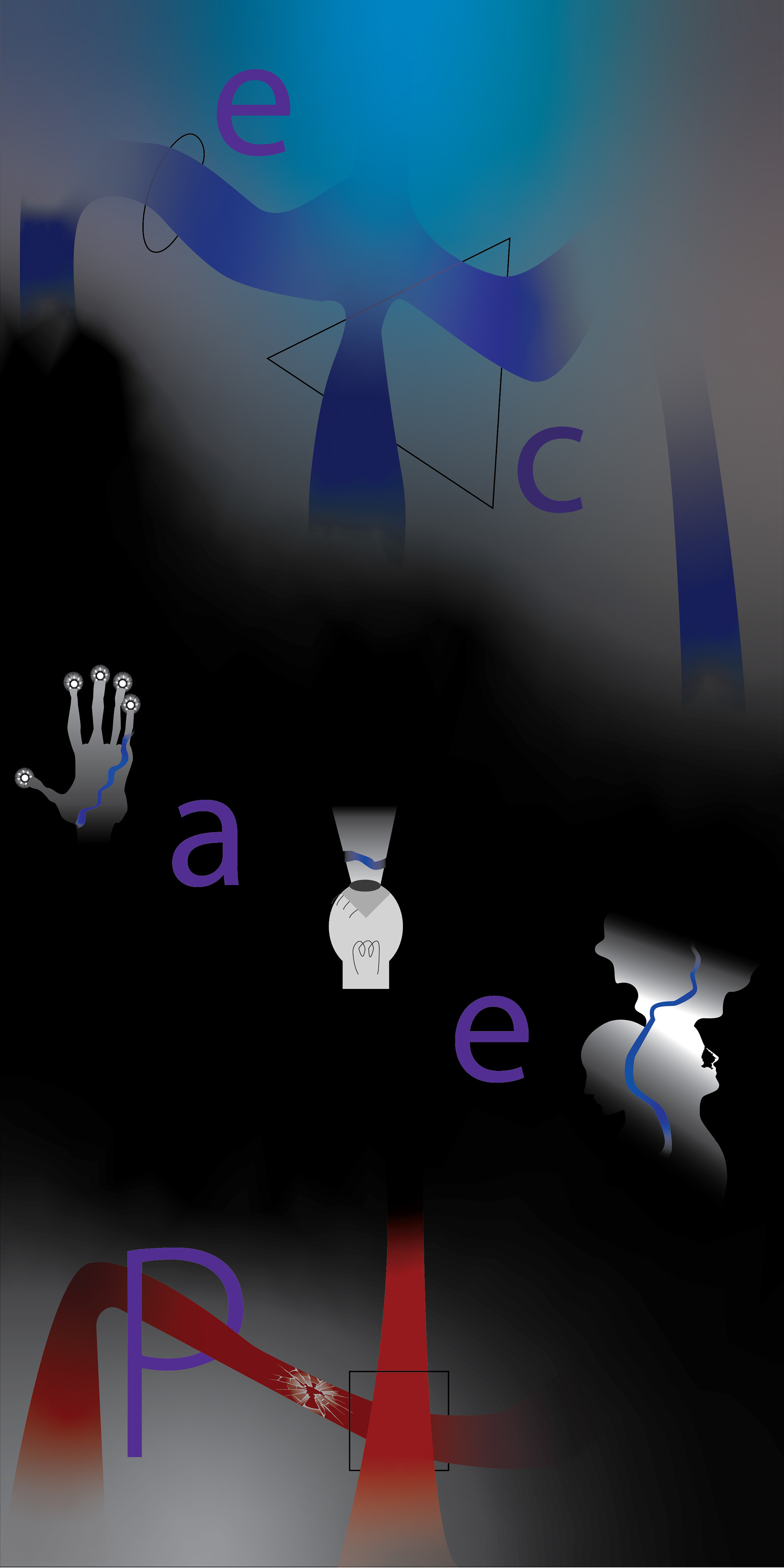
First Draft
Shapes and pattern description:
When I started on my first draft, I wanted a background that represent depression and struggling in most of the composition. Then a small bit of it to show calm and relaxing.
Usually when I hear the word "journey", I usually picture a road map in my head. So then I decided to draw some entry and exit paths. So naturally these paths represent the road that, that person is on. I drew multiple paths because no everyone takes the same path on this journey.
The drew the square and crack to represent events that happen on that path, as well as to give it some depth.
One of the requirements was to have a word from the title of the song in the composition. That's why the word Peace is in there. I chose the from the font list Didot, which was the thinnest typeface from the list. I did that because humans tend to read bold letters as if they were shouting or yelling that word. Peace is not word people generally shout out.
Finally I put some circles in the dark area to represent hope/faith during dark times.
Color choices:
I wanted the colors I piked to represent the human emotion that someone goes through in a journey.
Red represents excitement and passion.
Gray represents depressing.
Black represents feeling lost.
Blue representing calm, relaxing, safe, and sense of protection.
Purple representing mysterious.
White representing hope.
Full description:
The red paths at the bottom is someone excited because they are starting a new journey in life.
In one scenario they get close to the dark area, notice it, and then steers away from it. They then still continue on the path some events happen and then they slowly go toward the dark area. The gradient from red to black shows the slowness of the person heading toward the dark area.
The other scenario, they are doing fantastic everything is going great, then suddenly, something drastic happens and they find themselves lost in this dark place.
For the dark area, I didn't want to show any paths, I wanted the viewer to interpretative where the path is themselves. With the white circles seeing the light in dark places, even though they are few and far between.
At the top of the composition, the three paths show a path where someone was able to get out of the dark area. They feel safe, relaxed, relieved, and possible still a little sad. Some of those paths transparent out, I did that to show that the path after still isn't always clear, and that they may drift away from finding peace.
I also feel like this can go in reverse order from what I just described. Starting from the top, blue can represent sadness as well. So may be someone is felling sad, they feel depressed and then find themselves in a dark place. Once they get out they are excited and passionate that they were able to conquer the dark area in their life.
Finally I used purple for the word peace, because peace is very mysterious and a different state for everyone. If you ask a group of people what it means to have peace you will get a lot of different answers. Purple is also a combination of red and blue. For those two reason I thought purple was the best choice for the word peace.
Response from peers:
I received a lot of positive reviews from my peers. They said I was able to describe my work very efficient and thought that my color choice were spot on. There was two suggestions given to me. One was there was too much empty space in the dark area and that I should expand on that. The other one was to choose a different font because the serif font doesn't really go well with the composition, also that during a print the thin lines may get lost with the black background.

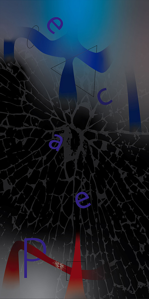
2nd Draft
In order to expand on the abstract part I tried looking the different ways people see the path. The hand with suns representing touch, the light eye representing visual sight, while the two heads representing meditation.
I got feedback that those icons weren't really working with the rest of the composition.
I also moved the square over a little for both paths. I added a triangle and oval to the top paths for the same effect and to describe an event but not the same as the square.
I changed the font to Myraid Pro to go better with the composition.
Finally I made the characters 'e','a', and 'c' lowercase and made a path go through the 'P'. This was done to help the users identify to start with the letter 'P' and read up. Since this is English, most people will try to read starting from the letter 'e'.
Final Draft.
For the final draft I decided to add a glass shatter effect in the dark area to represent hardship in the dark area. Instead having light in the dark areas, I think the audience would know that, even though they don't see a direct path, they do see light on the other side. That other side is what give them hope while in the dark area.
After that I went through some other ideas and examples. However after looking I honestly thought there was nothing more I could add to help describe the work, so I told myself this artwork is done.
What I learned from this project:
This was first abstract art I ever did. I honestly never understood abstract art, and I still don't quite do, but I did have fun with this art project. I amazed how some people can look at simple shapes, look at the color, look at the patterns, and be able to tell a story from it. I honestly just see shapes.
I occasionally work on user interfaces, which is almost the complete opposite of what you do with abstract art. So it was another very different mindset from what I am use to. Sadly I don't see how abstract art would help with my user interface skills.
If the band ever comes across this, I hope they think I did there song justice.
However, learning about the basic of color theory and psychology. I believe I can make better decisions choosing color in the future.
Extra:
This wasn't something that I needed to do for the class, but I wanted to challenge myself with.
I had a goal where I had to re-make another composition with-in 3 hours that is close to also representing the song. So I made the composition below:
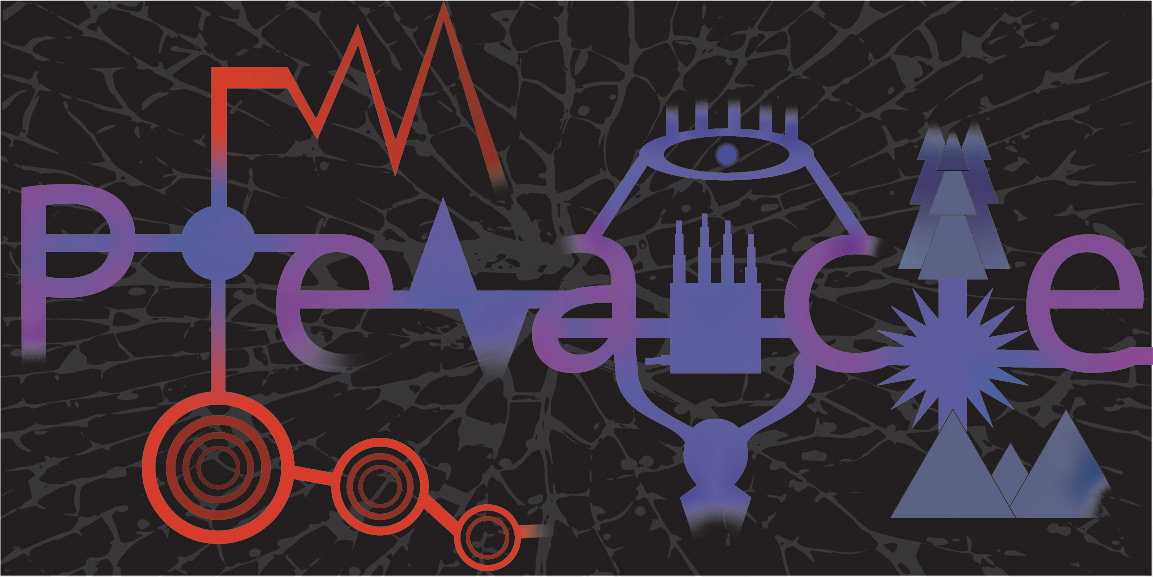
Below is the time-lapse of the composition above.