Graphic Design Class
Final Project - Concert Poster
***DISCLAIMER*** The tour and tour dates are not real. (They were required for the project.) I do not work for Demon Hunter or SolidState Records. I am simply just a fan.
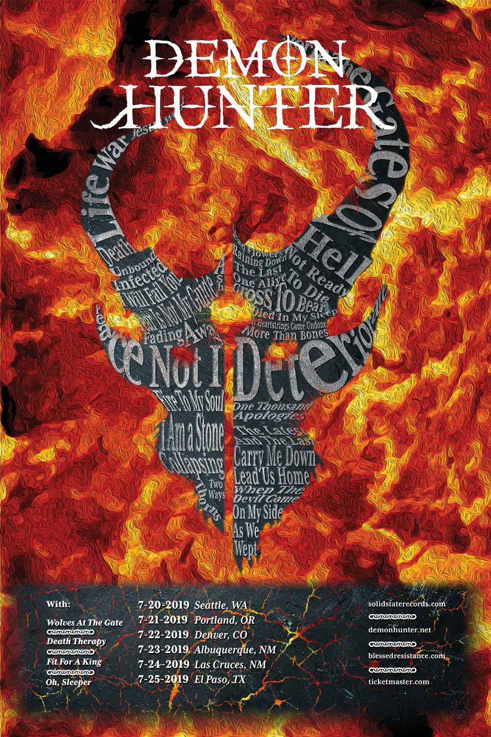
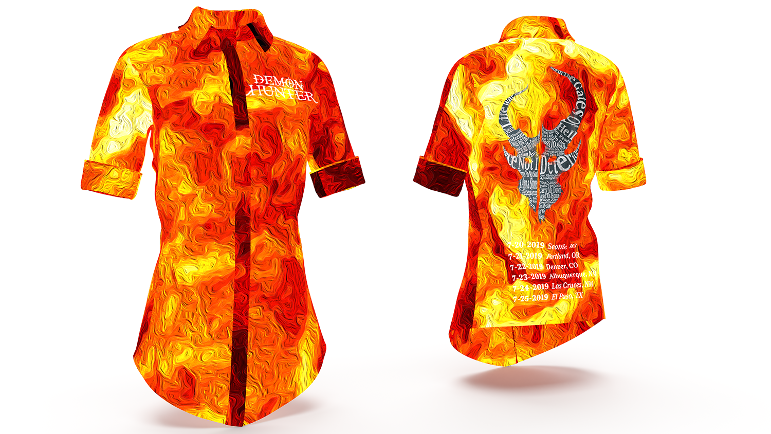
Final Composition


There was only a few requirements for this project.
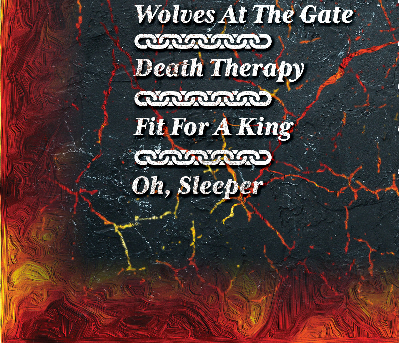
•The poster had to be about a concert. Either for a band, tour, or event.
•The poster had to be 16x24 inches.
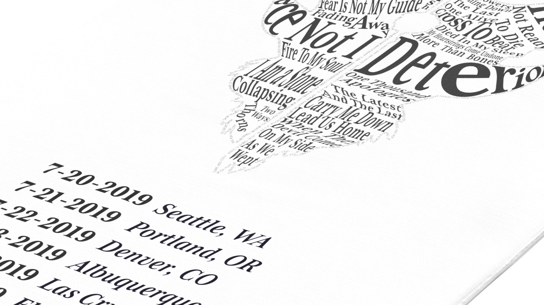
•The poster had to have concert date(s), location(s), and websites to find more information.
Everything else (fonts, colors, etc.) we were not limited on.
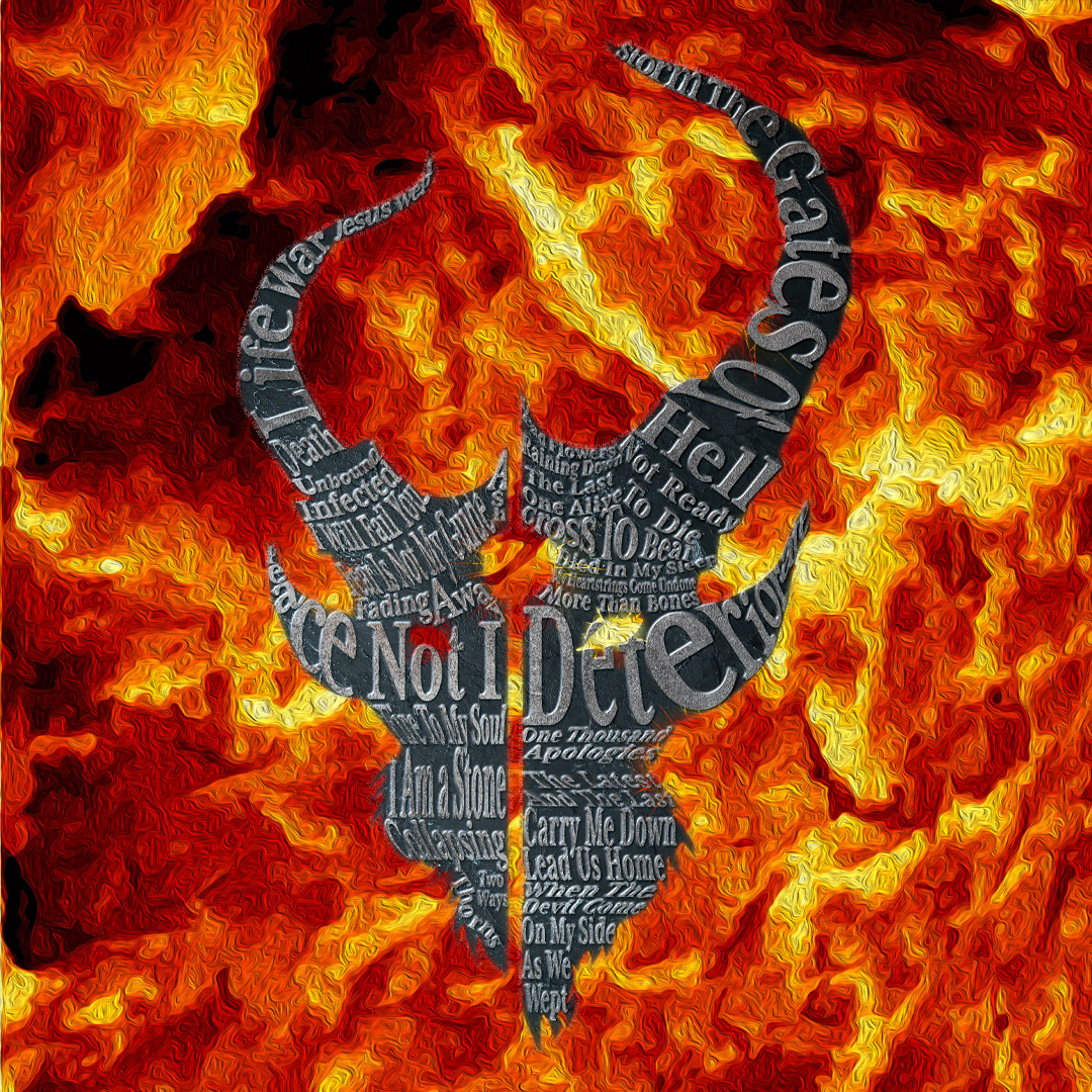
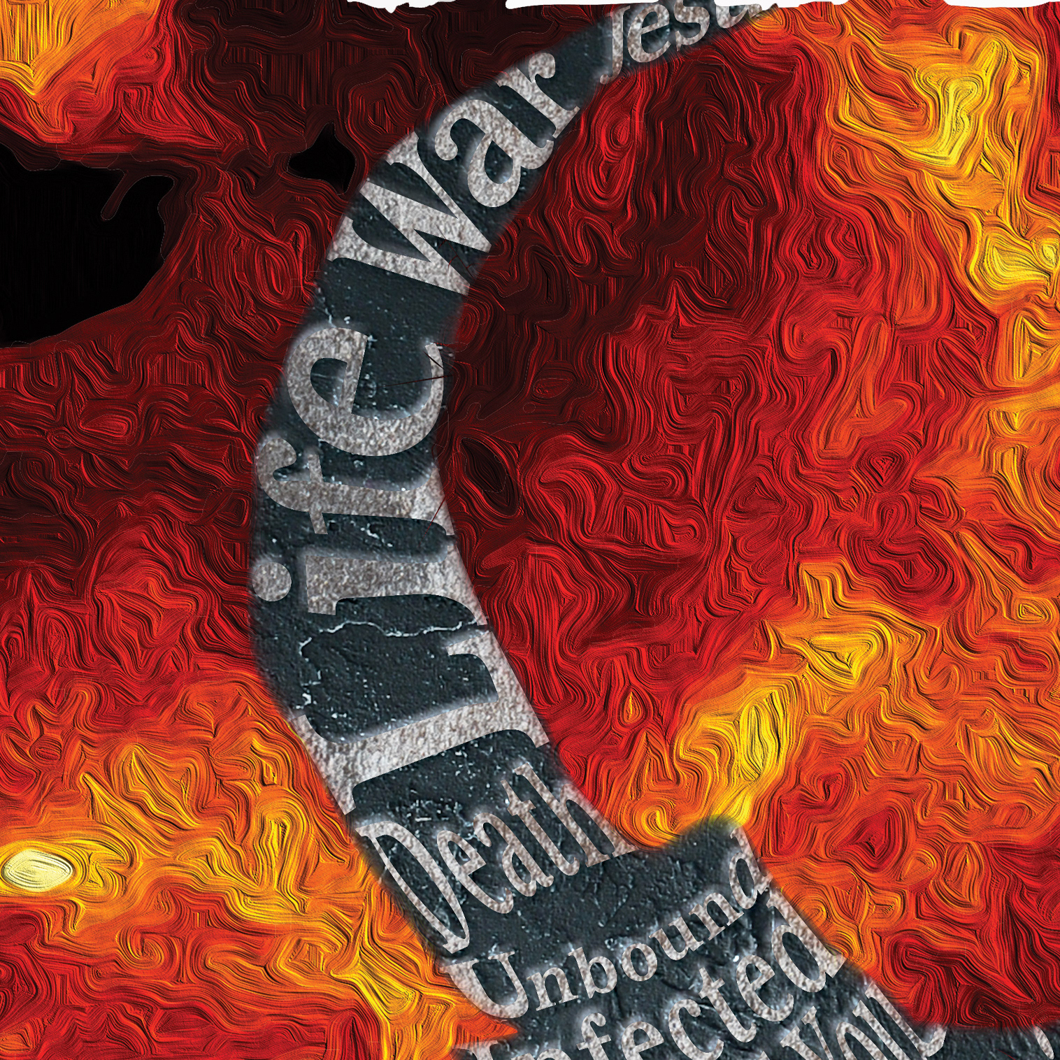
I have been a big fan of Demon Hunter and I am really loving their two latest albums, Peace and War. So I wanted to make a poster for them.
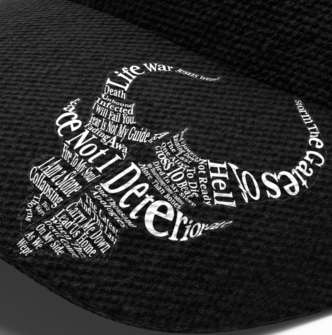
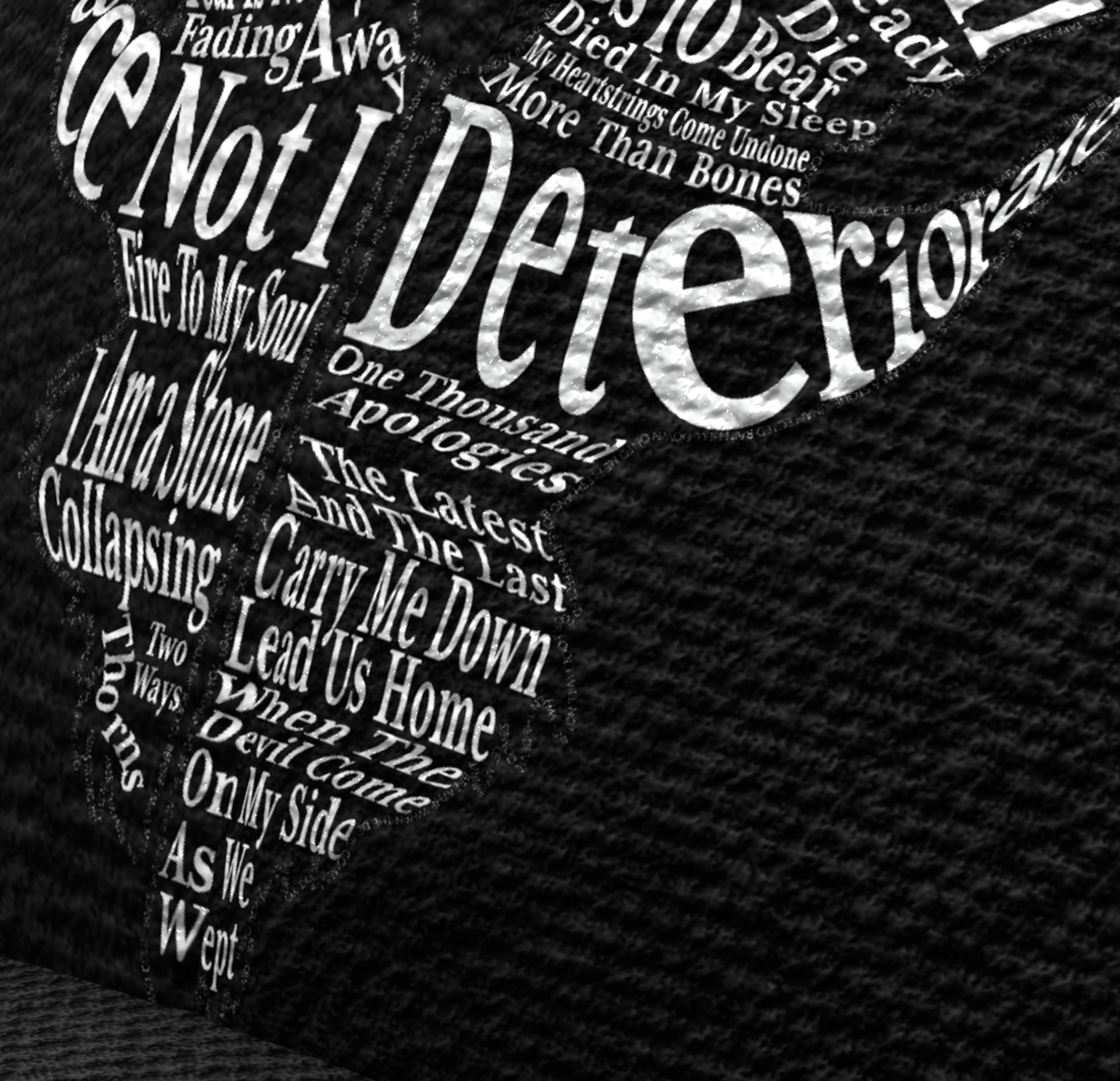
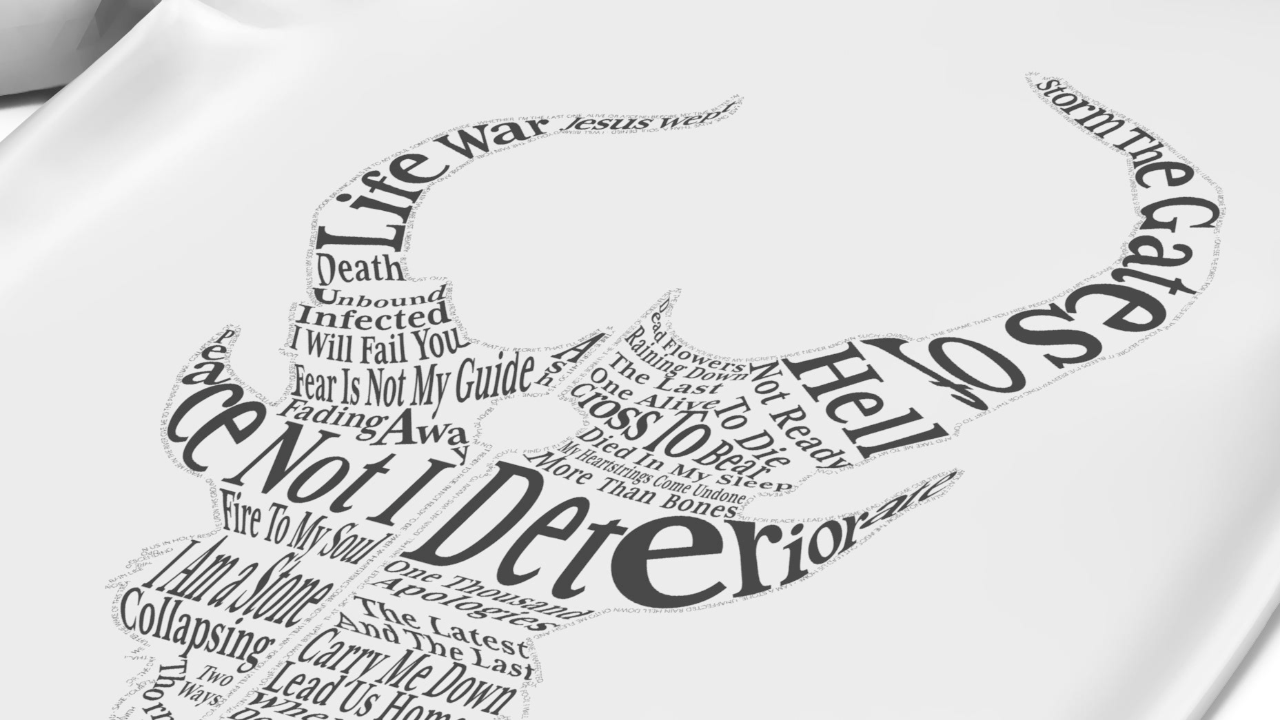
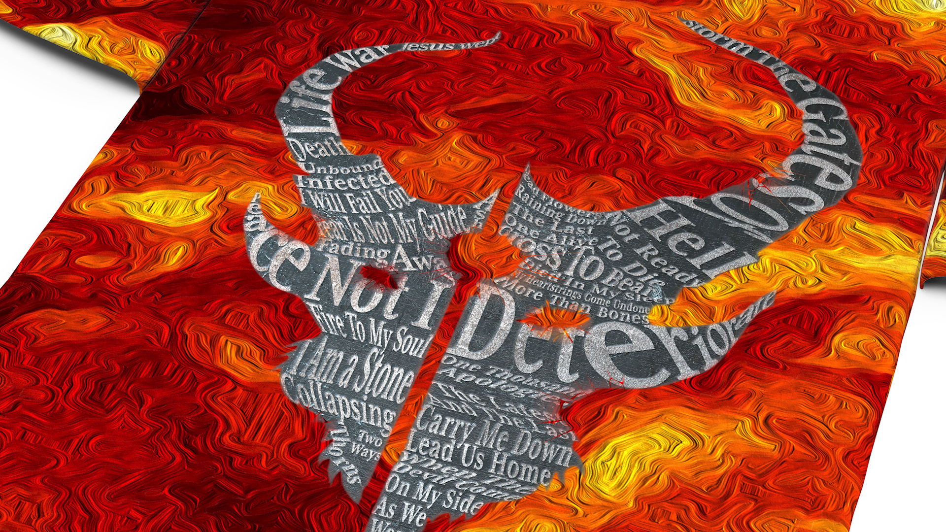
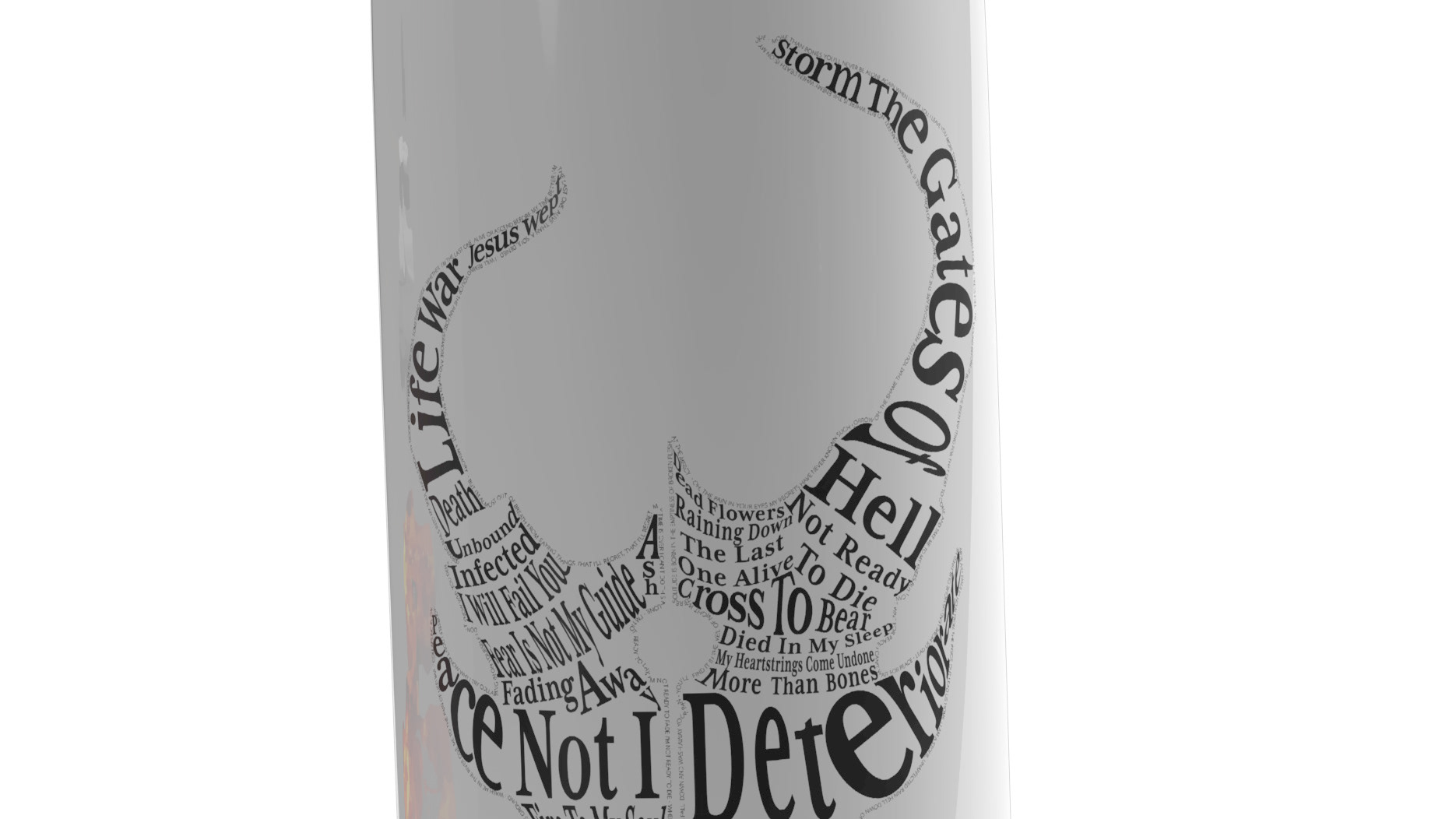
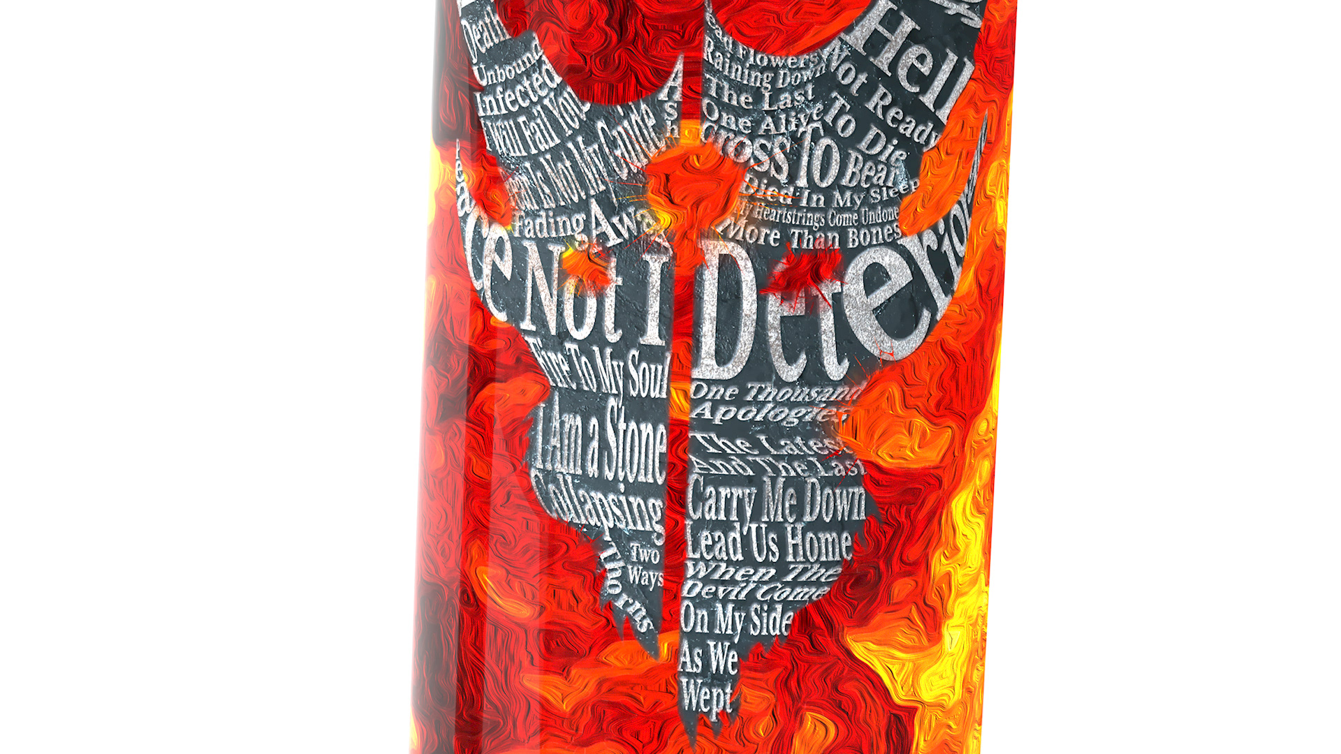
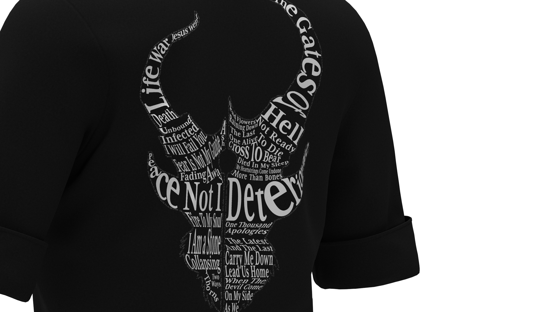
One thing about this band is they have this "mascot" that they put on all their album covers. So I wanted to make a "mascot" to use for this poster, so that fans would easily identify what the poster was about. I looked at all of their album covers as well as fan art and I tried to find something that was unique but simple. To me Demon Hunter is very tied to their song titles as well as their lyrics. So I thought it would be a good idea to make a "mascot" using words from those.
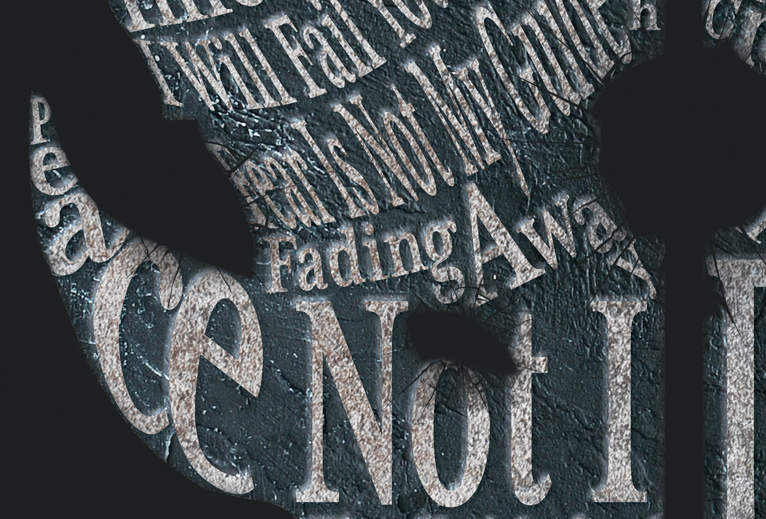
Outline using lyrics.
I started to draw the outline in Illustrator, this outline was heavily influenced by the "mascot" from their self-titled album. After I got the outline how I liked it, I started putting the lyrics. The next step was putting in the song titles.
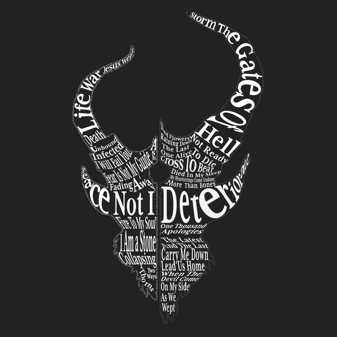
Titles used were based on both popularity and how I could make them work with the layout. There were three titles I initially wanted to use:
Deteriorate
Storm the Gates of Hell
One Thousand Apologies
These were the first three songs I herd from Demon Hunter and after I listened to One Thousand Apologies I bought their album with that song The Triptych. I've been a fan ever since.
Next I moved the project to Photoshop to add details.
Moved to Photoshop to add details.

Details

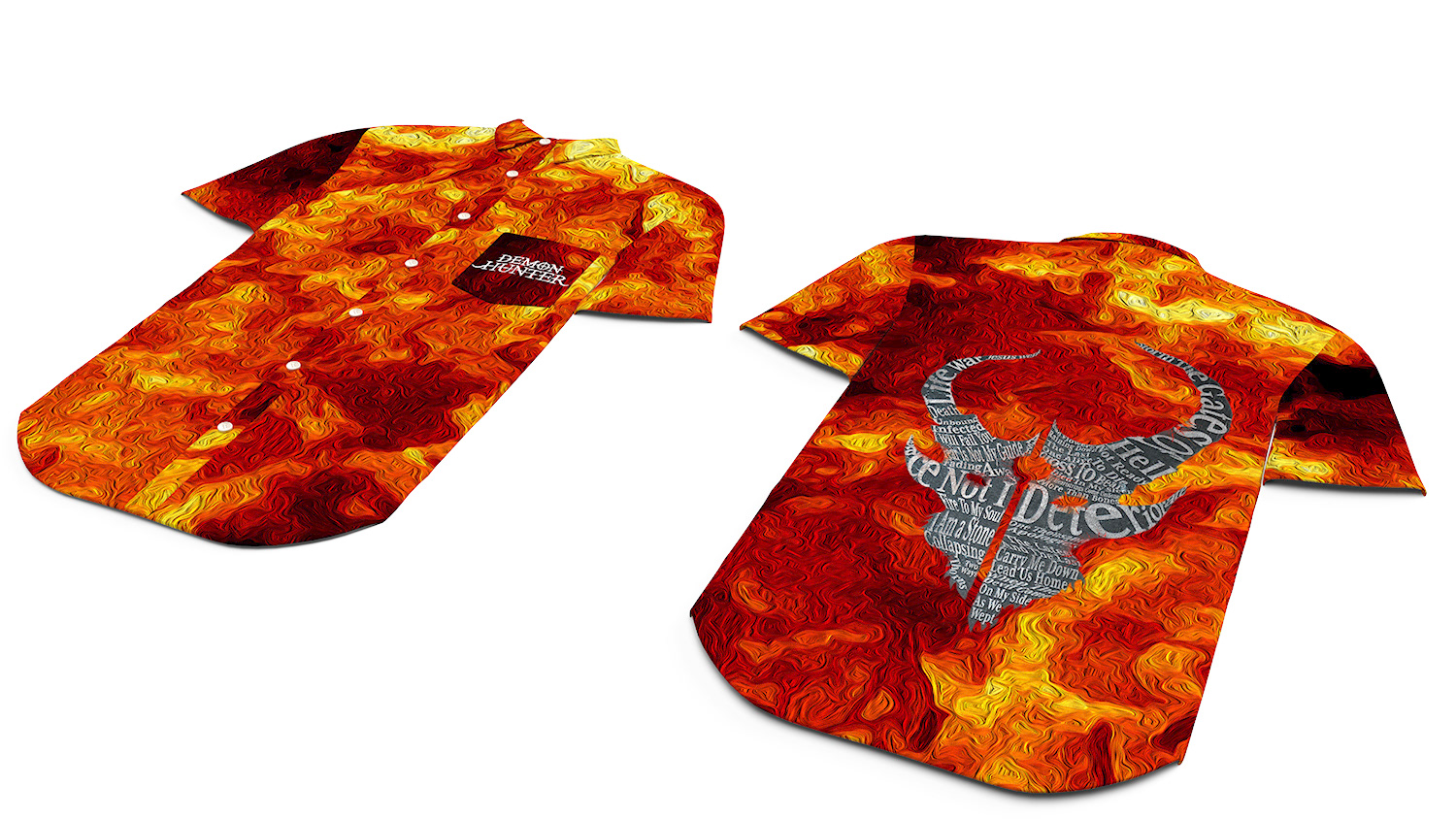
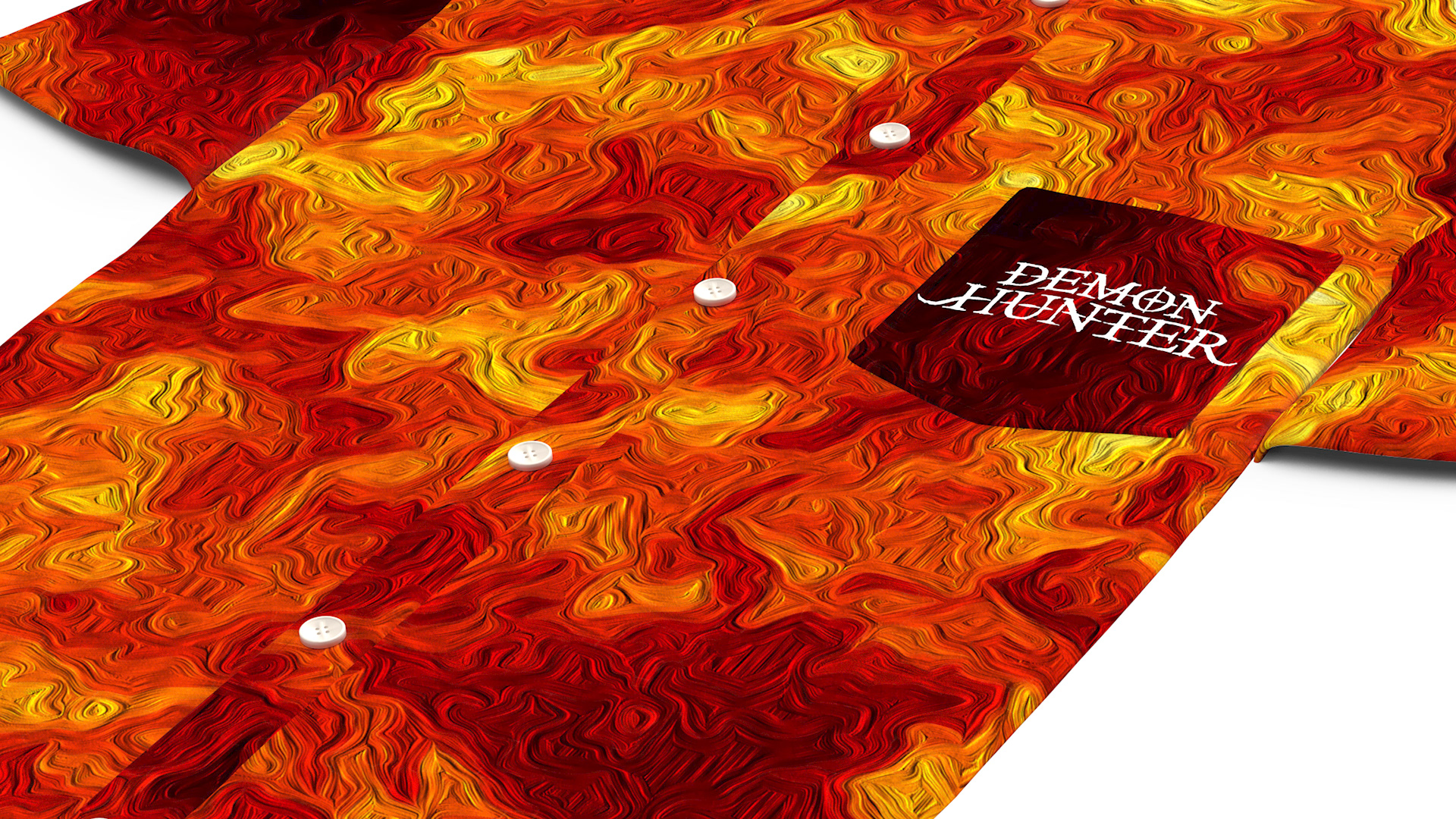
I added the background and used the Oil Paint filter to give it a unique look. Unfortunately I removed the outline as I couldn't really get it to work with background.
I then added the band's name at the top and the banner and information at the bottom. I then added the cracks in the banner at the bottom.
The background and details were chosen based on what metal bands tend to use for their posters and albums.
Details:

If you have enjoyed this please go listen to Demon Hunter. They came out with two albums, War and Peace just two months ago and they are both AWESOME!
Demon Hunter, keep up the good work. I really enjoy your music.
In addition:
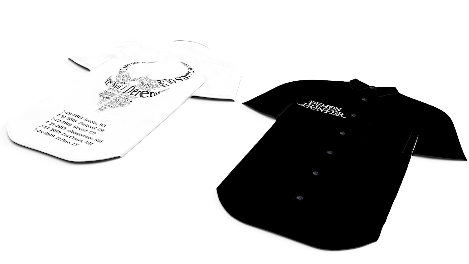
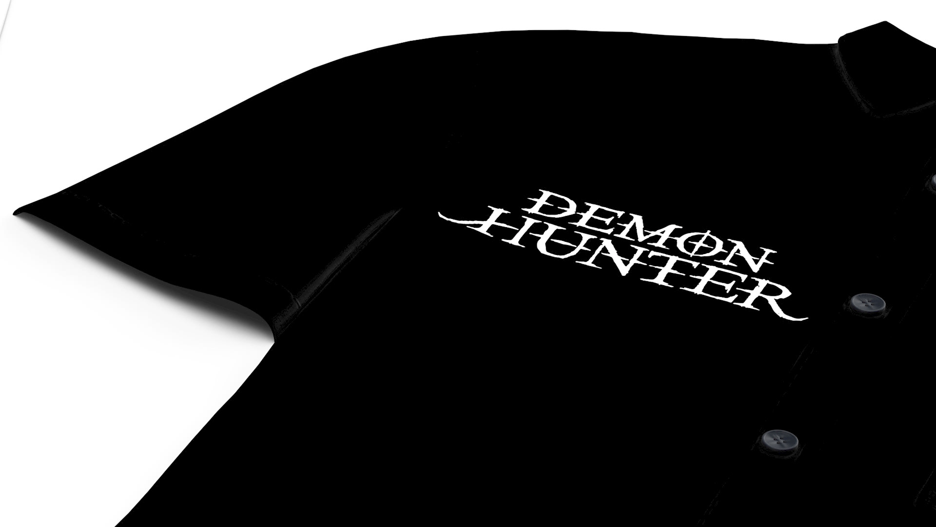
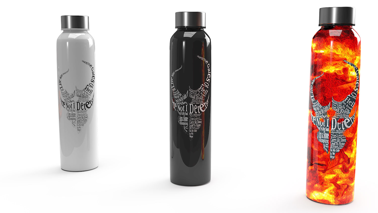
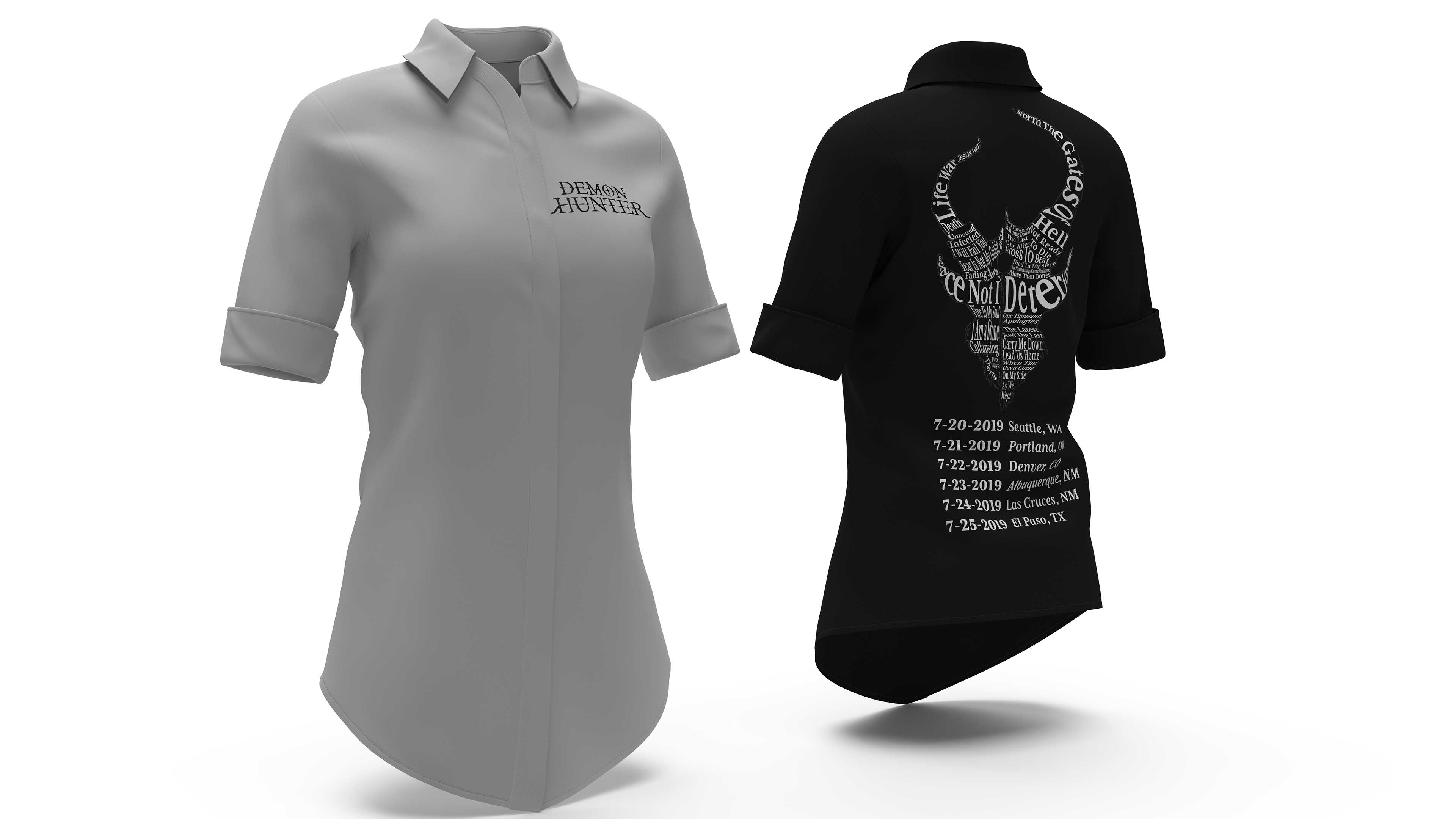
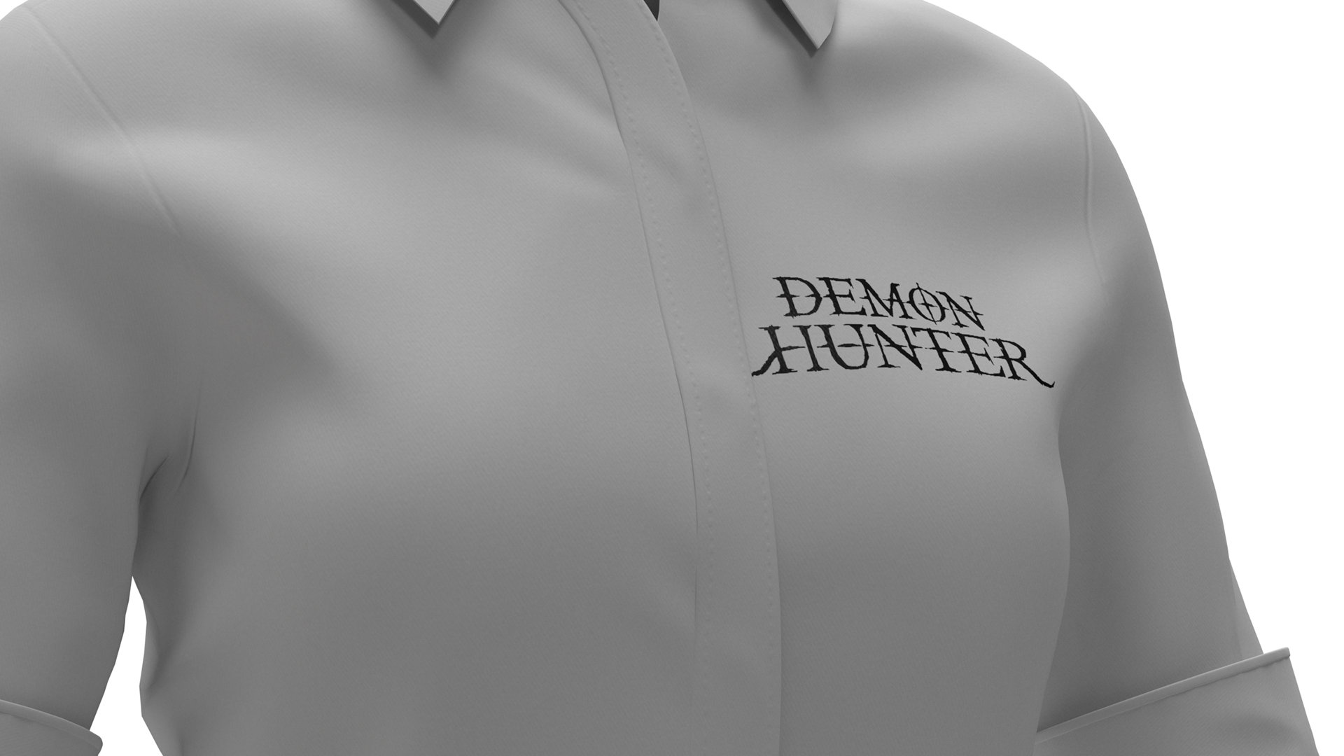
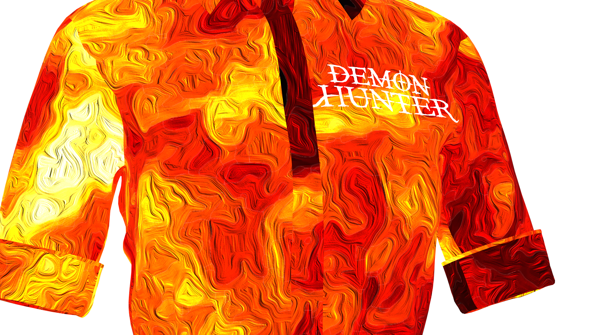
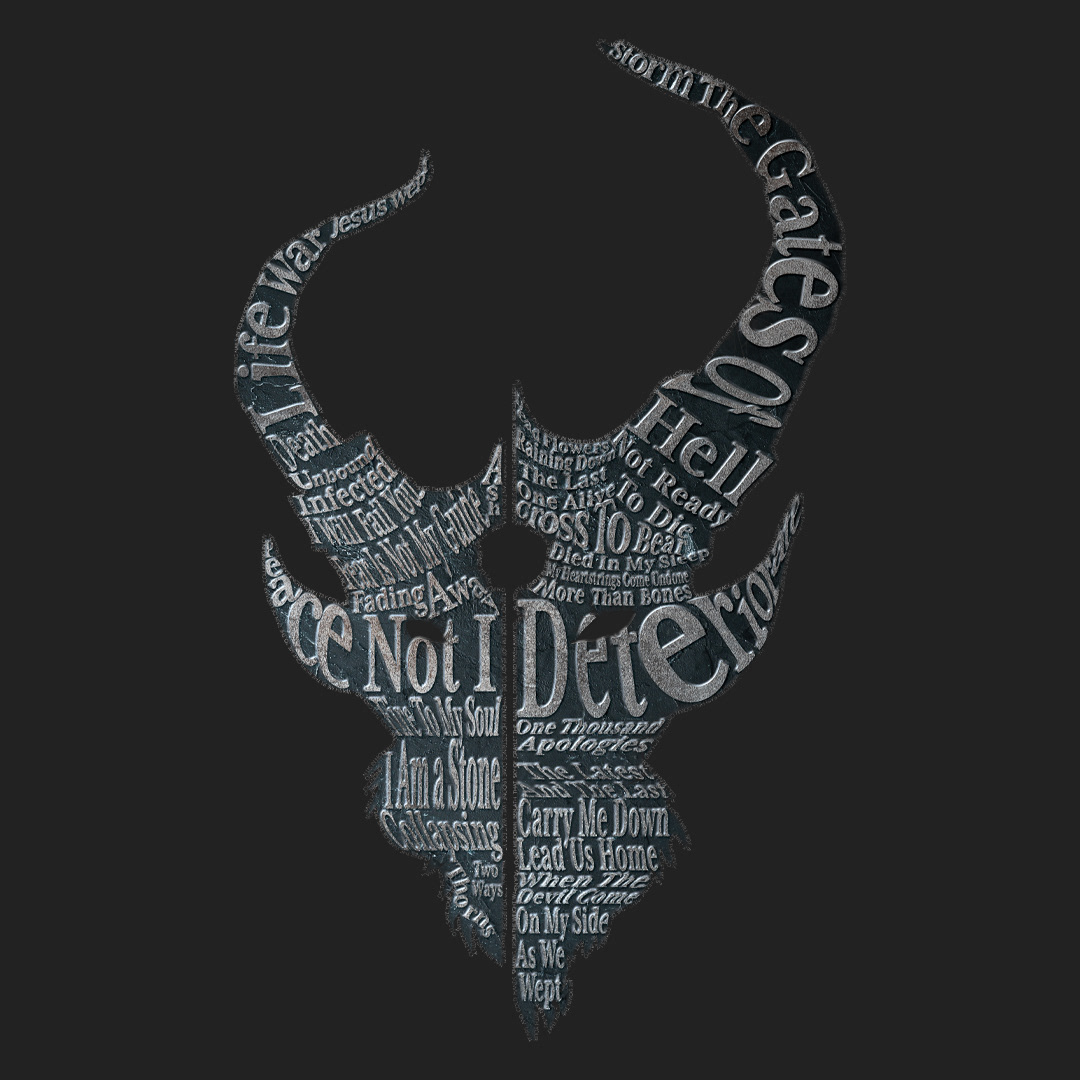
This wasn't part of the class project, but I wanted to also make some fake merchandise with the logo I made. Using Adobe Dimension I made the following: